|
|
T.O.P. Photographer of the Year 2006
Jill Greenberg
"Getting kids to cry isn't the nicest thing to do." The words are Jill Greenberg's.  In 2006 we were treated to what passes for a controversy in contemporary photography. Greenberg, a commercial studio portraitist from Beverly Hills—she had previously gotten attention from the art world for a series of beautiful studio portraits of monkeys and apes (right)—made a small series of pictures of young children crying. (A small exhibition catalog was published called End Times.) A blogger named Thomas Hawk (a pseudonym—his real name has been "outed," though I don't see any reason to repeat it here, since bloggers have a right to present themselves as they wish to be presented) wrote an inflammatory protest about the pictures, making charges of child abuse, among other things, and the argument has simmered incessantly from the blogosphere to the New York Times Magazine, including criticisms ranging all the way to death threats against Greenberg ( that's a bit much) to outraged defenses of her by the owner of her gallery and her husband, some of which were later withdrawn.  Jill Greenberg, pictures from the series End Times Jill Greenberg, pictures from the series End Times
I wrote in my magazine column recently about the uneasy relationship between ideas and their names, and between ideas for pictures and the pictures themselves. The fact is, sometimes a good idea doesn't result in very good pictures, and sometimes a fairly stupid idea can lead to great pictures. I think Jill Greenberg's idea—the nominal notion is that the Bush Administration is making the future cry—probably shades more toward the latter than the former, but I'll let Jill speak for herself, from an interview in American Photo magazine: American Photo: How did you come up with the idea for the project?
Jill Greenberg: "I saw this little girl who'd come to a party with her mom, and she was beautiful, so I thought it might be interesting to photograph her. When they came to my studio, the mother brought along her toddler son, and I decided to shoot him too. We took off his shirt because it was dirty. He started crying on his own, and I shot that, and when I got the contact sheets back I thought, "This could go with a caption, 'Four More Years,'" like he was appalled at George Bush's reelection. The images have a real power—they immediately get under your skin. The emotion you see is just so compelling, yet they're beautiful at the same time. That was one of the things that interested me about the project—the strength and beauty of the images as images. I also thought they made a kind of political statement about the current state of anxiety a lot of people are in about the future of the country. Sometimes I just feel like crying about the way things are going." It's not for me to try to put in the last word on the controversy, and I wouldn't put a cap on it even if I could: reacting to photographs is the right of every viewer, and I would no more seek to suppress the outrage of those who feel outrage than I would seek to censor the pictures. It's been widely noted that Ms. Greenberg and Paul Kopeikin, of Kopeikin Gallery in Los Angeles, have benefitted from the publicity: the prints of the crying babies sell for thousands of dollars each, and, I'm told, sales have been brisk. Personally, I can think of two dozen things more obscene than a crying child that are photographed every day, and as a parent I'm not particularly upset about the idea of making a child cry, although I agree that it isn't the nicest thing to do. I probably wouldn't have had the heart for such a project myself. But one thing I will say is that photographers often show things that non-photographers would prefer not to look at, or at least would not choose to commemorate. It's always been thus, and it ever will be. What I think has been overlooked is that the pictures themselves are amazing, and not like anything you've ever seen before. Jill Greenberg has developed a name that is almost Koonsian* in its shiny, sculptural plasticity, perfect for the emotional remoteness of her postmodernistic gaze. It's perfected and distanced from perfection at the same time. The pictures themselves are beautiful and original, familiar and moving and yet still strange and new. They certainly encapsulate, just perfectly, an ambivalence between looking and not looking, between objective aesthetics and subjective empathy. Encouraging people to think, and encouraging immediate, visceral—and, moreover, personal—responses are a big part of what art's all about. For managing that (perhaps to a greater extent than she'd bargained for) while at the same time bringing new vitality to the modus of the classic, straightfoward head-and-shoulders studio portrait, Jill Greenberg is T.O.P.'s Photographer of the Year for 2006. Posted by: MIKE JOHNSTON* The reference, in case it's unfamiliar to you, is to the American artist Jeff Koons. UPDATE: As a corrective to some of the more hysterical comments I got about this post, I thought a little moral and emotional calibration might be appropriate. This is an injured child:  This is not an injured child: 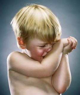 This is brutality:  And this isn't:  This is neglect:  This isn't:  This is an atrocity:  This isn't:  Child pornography exists,  But this isn't an example of it...  And so forth. Do I need to go on? (I'm sorry to say that in poking around the web for these, I stumbled on a picture that truly shocked me, of a child of about four performing fellatio on a grown man. I'm sorry I saw it myself, sorry I now have that in my head—and sorry that crimes like that are committed on any child. But needless to say, that's exploitation, and it's on a different moral plane altogether from watching a healthy kid cry for five minutes.) Mind you, in objecting to the polarizing tendencies of others, I hope I'm not polarizing myself here—there is an element that is distressing and, yes, even a little disturbing (in the sense of not-quite-right) in Greenberg's pictures. I can sympathize with people who are villifying and even demonizing Greenberg, to an extent. But what they're talking about are their own feelings, not anything objective about the children, or their parents, or the photographer. There is another issue no one has broached yet. To me, there is also something a little disturbing about people who reserve their strongest outrage and disapproval for relatively benign, palatable transgressions, while remaining silent about things people really ought to speak up about if they have the freedom to. I can't, and won't, paint any individual reading this with that brush; obviously, no one has expressed the entire range of their moral positions, nor do we need to in order to comment on one issue. But do you know what I mean? It's like people who express deep outrage about dead cat jokes and then keep silent about the millions of healthy cats that are euthanized every year. It's a form of moral displacement. There's something a little off about that, too. But back to the pictures—I'm getting pretty far afield. We've heard a lot about how Greenberg's political associations are just dumb (I agree) and that the End Times pictures are kitschy (they sort of are, but in a good way—anyway, you try it), but one thing no one has done yet is this: propose another set of pictures made during 2006 that is more memorable, or that has been as much a part of the visual zeitgeist of the times during the past year. That's a comment I'd like to read. —M.J.
Comments are now closed for this post—thanks. (Bob Walters either summed everything up or brought them to a new low, I don't know, but I'm feeling a bit traumatized by all the disputation. Being the "comment gatekeeper" is the worst thing about blogging....)
I have no brief to vent political opinions here, and I seem to get in trouble every time I do, but apropos recent developments in Iraq—one development swinging from the end of a rope in particular—I'd just like to observe that a high percentage of the worst, most destructive, and (yes) evil leaders in history all share one particular psychological personality type: that of the sadistic narcissist. We got rid of one of them yesterday, but consider the utter misery that that one person fomented in his miserable lifetime. If humanity could somehow organize itself sufficiently to prevent this type of human being from ever achieving absolute power, even in isolated circumstances, we could really go a long way toward making a significant dent in human misery. Back to regular programming; sorry for the interruption. Posted by: MIKE JOHNSTONUPDATE: Thanks to all those who commented on this. I read all of the comments, although I posted very few of them simply to avoid disputation. I just wanted to make the small point above. I agree with those who have said it's not the whole story, or even a very important part of it. And yet.... —M.J.
T.O.P. Achievement Award 2006
 This year T.O.P. extends special recognition to Wilhelm Imaging Research and its founder, Henry Wilhelm, the famed print permanence researcher and consumer gadfly. He took the credibility he earned over years of working on permanence issues with traditional materials, and leveraged that to basically transform an industry. No, not him alone, and yes, there were good commercial reasons for the printer vendors to respond, and yes, one can quibble from now til doomsday about the particular measures he uses. But in the end, he's the one who did the most to make digital photography a viable medium for serious users. Why "digital photography" and not just "inkjet printing"? Because without the latter, there would still be no practical way for the vast majority of serious digital photographers to also be serious printmakers. Yesterday's T.O.P. Accessory Award for pigment inksets brings this up with perfect clarity. Without Henry Wilhelm and his long-running campaign of evidence-based constructive criticism and consciousness raising, none of those products would exist. Until inkjet print materials achieved a modicum of both quality and permanence, photography was heading for an awkward limbo. Digital cameras had come to dominate, but the tools that would allow an ordinary user to make a fine print from a digital source file didn’t exist—nor would they have come to exist any time soon, had manufacturers only the untutored preferences of the mass market to guide their product development. In praising Wilhelm, we mean no slight to the many talented engineers behind today's printers. But without Wilhelm’s skill and persistence in shining the spotlight where it was needed, those talents would have been directed elsewhere. Nor is the permanence problem fully solved. Dip into the technical literature, and you’ll come away appreciating just how much we still don’t know about what it takes to make prints that will last not just in controlled-environment storage, but under realistic display conditions. As time goes by, we are sure to discover new failure modes not captured by current test methods. But today’s best inkjet materials are, without question, vastly more permanent than anyone imagined possible only a short time ago, and stable enough to provide a robust foundation for the printmaker’s craft. That's Wilhelm's doing. We all owe Henry Wilhelm—big time. Posted by: OREN GRAD
Nobody asked, but here are my fave non-classical 2006 music releases: 1. M. Ward, Post-War2. Avishai Cohen, Continuo 3. Neko Case, Fox Confessor Brings the Flood4. Califone, Roots & Crowns5. Howe Gelb, 'Sno Angel Like You6. Gnarls Barkley, St. Elsewhere7. Gotan Project, Lunático
8. Muslimgauze, Speaker of Turkish9. Carl Filipiak, Looking Forward, Looking Back10. Grizzly Bear, Yellow HousePosted by: MIKE JOHNSTONP.S. Ys, I like the Arctic Monkeys like everybody else. Photo: Howe Gelb and the Voice of Praise Gospel Choir
T.O.P. Photography Accessory of the Year 2006
WinnerJoint Award—Epson, Canon, and HP for ULTRACHROME K3 (Epson), LUCIA (Canon), and VIVERA (HP) pigment inks ( not all introduced this year, but all available at the same time for the first time this year). Although photographs can now be used in many purely electronic forms, the highest expression of photographs as fine art has always been the fine print—and prints with poor longevity have little integrity. Epson gets credit for the earliest use of pigmented inks. Now, it has two such inksets, and these have been joined by Canon's professional 12-ink Lucia set and HP's 8-ink Vivera set. In general, I think these inks are more attractive than dye inksets—they're a bit more subdued, seem to have more body, and don't as easily run to unnatural dayglo brightness—but the work these companies have done in creating inks with such good life expectancy is as admirable as it was needed. Of course, the applause the ink makers care about is whether the products are profitable, but then, if you're using a pigment inkjet printer, I bet you feel like you're doing your part where that's concerned, eh? Runner-UpThe Upstrap—When I blogged about these, a few people actually wrote in to say they didn't care for them, which only goes to show that on this planet there are people from another planet. The Upstraps are the greatest thing since sliced bread. They're the proverbial better mousetrap. I couldn't be more amazed than if someone invented a perfect camera bag or the ideal tripod (two other categories of accessory that will never be perfect, most likely because they're imperfectible). I have Upstraps on all of my cameras. They are one accessory that I appreciate every single time I use one. Posted by: MIKE JOHNSTON
The Online Photographer has been named by National Geographic Traveler as one of the best places to learn about photography on the web. ( Section 3, second paragraph from the bottom.) "My favorite website," says Dan Westergren, Picture Editor for National Geographic Traveler, " where you can find discussions on all aspects of photography." Many thanks to Dan for the kind kudos.
Posted by: MIKE JOHNSTON
I've just established a separate website for current and archived T.O.P. print offers. It's called "T.O.P. Fine Print Sales." Please bookmark it! (I'd be happy to hear comments about what you think of it, too.) Eventually, full information on offers will appear there, with shorter announcements here. Posted by: MIKE JOHNSTON
 I'm happy to report that T.O.P. contributor Ctein's new book is out. Digital Restoration from Start to Finish is a massive compendium of everything you'd ever need to know about the subject, published by the great old publishing house of Focal Press, which has been publishing some of the best photo-technical books since the 1930s. You can do Ctein a favor by buying an autographed copy directly from him. (He earns a bit more that way.) Oh, and by the way, I'll be reviewing this book soon...somewhere. I'll let you know. Posted by: MIKE JOHNSTON
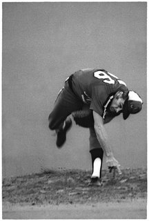
 Here's an example of how a picture can be grainy, selectively unsharp, and unconventionally composed, and yet still be...well, perfect. This great shot of former Major League pitcher and Ball Four author Jim Bouton by photographer Ancil Nance was first featured on T.O.P. in a posting last October. Ancil has kindly cooperated with me to help make a T.O.P. fine print available. It was August 5th, 1977, at Multnomah Stadium (now PGE Park) in Portland, Oregon. Bouton, who'd retired from the Major Leagues in 1970, the same year his famous book was published, was making a comeback pitching for Bing Russell's Minor League Portland Mavericks (you've probably heard of Bing's son Kurt, also once a Maverick but now famous as an actor). Nance was on assignment for the Oregon Times, charged with getting a shot of Bouton's famous "hat trick" that he used to distract batters. (Nance got that shot too.) "I was someplace behind the backstop trying to shoot over and through the catcher and ump," he says. Formally, the odd shape the pitcher's body makes simultaneously emphasizes athletic effort and graceful balance. The back wall, brought close by the telephoto, seems almost like a dark cloud (I removed a distraction from the left edge), and the blank space at the top suggests the position his upper body occupied just moments before. His hat nearly touching the center of the edge of the frame provides the composition with dynamism and directionality. The white accents are what give the print its tonal vividness. Although the picture has plenty of selective motion blur, you can easily recognize that it's Jim Bouton. Our print is made from a large new scan provided by the photographer. The image is 5 x 7.5 inches, printed with carbon pigment inks on a larger sheet of Moab Entrada Natural. Apropos our discussions in the "On Printmaking" post, in this case the photographer was sent a proof for approval and shares the proceeds. A small number of signed prints are available for a higher price. Unsigned prints will be shipped this coming week; signed prints will require a delay of up to several weeks. Apart from the photographer's signature, the signed and unsigned prints are identical. Worldwide shipping is included in the price—Priority Mail within the U.S., Airmail elsewhere in the world. This is a lovely little print, and I'll say again what I said last October: have you ever seen a better picture of a pitcher? Here's my own answer: there may be some others as good, but none better. It's going up on my wall. Many thanks to Ancil Nance for agreeing to make this offer possible.  UNSIGNED UNSIGNED, $75 SIGNED, $120 Posted by: MIKE JOHNSTONP.S. If you happen to be a baseball fan and know of any baseball sites or forums, I'd be grateful if you'd mention this offer and/or provide a link. I'm sure there are baseball fans out there who don't normally collect photographs who might want to know about this. Thanks!
T.O.P. Picture Book of the Year 2006

Winner"The" book of 2006 may not be the easiest or the prettiest book of the year. Published by Steidl, photographer Robert Polidori's massive, detailed documentary investigation of the effects of wind, floods, and bureaucratic foul-up on America's most distinctively beautiful city is meticulous, strangely attractive, and fascinating page after page. Robert Polidori was not the only photographer to make outstanding pictures in Louisiana and Mississippi after Katrina. (And I have not seen this mentioned elsewhere, but the first photographer I know of to make this kind of extended artistic documentation of the effects of hurricanes was Maryland photographer Jim Sherwood, in the 1980s; I wrote about Sherwood's work for the old Camera & Darkroom magazine. His work constituted an investigation, not just the news documentation typical of earlier eras, and his precedence in this subject-matter area deserves acknowledgement.) One of the great problems of Katrina is the formidable disjunct between our images on television and the devastation people report seeing in person. Robert Polidori has created a partial antidote to the disjunct, in pictures of "terrible beauty" that people will still be looking at with sober fascination a century from now. Runners-Up History Images by Sze Tsung Leong History Images by Sze Tsung Leong Photographers have always found significant motivation in recording things that are becoming rare because of change. Our world is changing rapidly now, thanks to burgeoning human population, international shipping and communication, and the globalized economy. Leong has recorded the razing of traditional buildings and neighborhoods in the Chinese cities of Beijing, Shanghai, Chongqing, Nanjing, Pingyao and Xiamen to make way for massive new construction, and his sober views of these nearly fantastical scenes is thought-provoking, distressing, fraught with awe.  Niagara by Alec Soth Niagara by Alec Soth Photography always has room for the poetic, and Alec Soth's wry, beautiful little personal investigation into some of the oddities of turning a natural wonder into a honeymoon destination; along the way he creates a visual meditation on romance that is touching, implies the sordid, and acknowledges both wonder and our decidedly Earthbound nature. The effect is surprisingly wistful. It may, in fact, be a richer experience than an actual visit....  Looking East by Steve McCurry Looking East by Steve McCurry These are not new portraits, mostly. They've been seen and celebrated in numerous outlets and venues over recent years, from the cover of National Geographic to art galleries. But this book may be the best way to own and enjoy a selection of them for yourself. The large size works beautifully and the reproductions seem almost as rich and deep as oil paintings. This is one of those books that's more than the sum of its parts, a nice object to own and a great way to enjoy this outstanding work. Posted by: MIKE JOHNSTON
By Carl WeeseMost references to anti-shake technology talk about using long lenses at shutter speeds normally useful only with normal lenses, or about working in very low light conditions for reportorial-name shooting with short or normal lenses wide open at shutter speeds that were not possible to hand-hold in the past. The rule of thumb with 35mm cameras is that you can, with practice, expect a good success rate at about the reciprocal of the focal length, i.e., 1/60th second with a normal 50mm lens, 1/30th with a 35mm or a 28mm, 1/250th with a 180mm. For a DSLR with a 1.5 factor relative to 35mm you'd up those rule of thumb speeds by the same 1.5 so a 40mm/60mm-equivalent should need 1/60th sec. I've been thinking about another potential use. The light in a forest during a soft rain can be magical, though in winter it can be pretty uncomfortable to work with. I've done a lot of large format pictures in this light, but it's arduous work with many traps to ruin pictures, ranging from tripod legs sinking into soft ground to large pieces of film buckling during long exposures because they've absorbed too much humidity. Working in wet conditions with a small camera on a tripod isn't a whole lot more expedient. When I first got a good DSLR several years ago, which had weather-resistance as a key feature, I went out to shoot rain in the forest, both on tripod and in a freewheeling, walkabout manner. The weatherproofing worked fine, though it was hard to keep water drops off the lens, especially handling the camera on a tripod. With the small sensor and short lenses of digital capture, a few drops that would have no meaningful effect on an 8x10 camera's results show huge soft blobs in the DSLR picture because of the enormous depth of field. But I also found that, despite that relatively deep focus, I didn't like my results with the lenses wide open, which they had to be to work in the dim light handheld. A really shallow plane of focus and wildly out of focus backgrounds—the "selective focus" technique—just isn't what the woods look like to me. Not that I need Group ƒ.64 universal focus, but considerable depth and a fair amount of definition even in the out-of-focus background seems necessary. So when the day after Christmas offered soft and beautiful light with on and off gentle, but chilly, rain, I headed to my favorite nearby forest reservation for an experiment. First, a digression about hand-holding slow shutter speeds, or speeds that are slow in relation to a long lens. Any marksman knows that no matter how steady and accurate your aim may be, if you flinch the release of an arrow or jerk a firearm's trigger instead of squeezing it skillfully, you simply will not hit what you aimed at. In fact, a steady aim isn't especially important at all. What counts is being able to have the aim perfect at the exact instant of an equally perfect release. Watching photographers over the years, including plenty of pros, I'm convinced that far more hand-held pictures are ruined by lousy shutter release technique than by shaky hands. Any marksman can also tell you how to get better at this. It's the same way musicians get to Carnegie Hall—practice, Dude, practice! End digression. What I wanted to find out was whether the SR function of the Pentax K10D would let me stop down to apertures that gave the depth of field I wanted and deliver good results at the resulting shutter speeds, which could not reasonably be expected to work without anti-shake technology (I was thinking of, say, 50/50 success instead of one out of ten). This way I could walk around with the camera cradled in my hands, lens pointed down out of the drips and drops, and lift it only to make exposures of interesting subjects. In the woods, I set the K10D to one of its two Aperture Priority functions, set the ISO to Auto with range limited to 100–400, with the aperture for the 21mm/32mm-equivalent lens at ƒ/8, and of course, the Shake Reduction function switched on. The first thing I looked at...  Persistent Leaves, Hidden Valley Persistent Leaves, Hidden Valley...came in at 1/8th sec. exposure, and while the background of this close framing is certainly not in focus, I think it works fine whereas with the lens wide open barely a single leaf would be sharp and the background would have turned to mush instead of reading as forest floor. The texture of the leaves is wonderfully detailed in all five exposures I made (this is simply the prettiest), but that won't be terribly apparent in small web repro. So SR passed its first test as a virtual tripod for this sort of shooting. Here is a shot done from considerably greater distance at 1/6th sec....  Two Trees and the Shepaug, Hidden Valley Two Trees and the Shepaug, Hidden Valley...the bark of the two trees crackles with detail in the original file and the laurel leaves in front are in quite good focus. While the focus is not universal from front to back, I like it much better than I would a sharp zone of a foot or less, which is what it would be with the lens wide open, which is what it would have to be for a rational unassisted shutter speed of 1/30 sec. I did a lot of captures over an hour or so. I shot each idea two or three times. When ƒ/8 pulled the shutter below 1/4 sec. I opened to ƒ/5.6. There are some captures that look soft at 100% view but few that wouldn't look fine (at least for resolution) sized for a small print. The amazing thing is that a large percentage of them look OK even at 100% and so could easily be interpolated up well beyond the native (13-inch wide) resolution of the K10D. If you'd like to see more of these captures, just to think about the sorts of pictures this technique lends itself to—you can't judge resolution from the web-prepared files—pop over to my web log to see a few others in the posting for 12/28/06. Posted by: CARL WEESEPart I is here.
T.O.P. Technical Book of the Year 2006
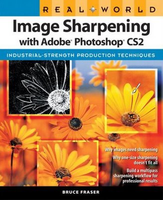
 Real World Image Sharpening With Adobe Photoshop CS2 Real World Image Sharpening With Adobe Photoshop CS2 by Bruce Fraser (Peachpit Press, 304 pages, 2006. $26.39 from Amazon.) The last published book by the late Bruce Fraser, first recipient of the Lifetime Achievement Award from the National Association of Photoshop Professionals (NAPP). Although arguably not as important a book as his pivotal Real World Camera Raw With Adobe Photoshop CS2 , or his earlier book on color management, Image Sharpening is a generous and exhaustive treatment of this sometimes elusive subject by the guy who developed the award-winning and widely used PhotoKit Sharpener. Meaning, the guy who wrote the book was the guy who wrote the book, if ya follow. I knew this title should win T.O.P.'s Tech Book award when I read a dismissive online review pointing out that you can just go get PhotoKit Sharpener and be done with it, that nobody needs to know this much about sharpening. Well, maybe not—but y'know, enthusiasts are people who want to know a subject from the ground up and from the inside out, and to whom the nuts and bolts of good technique are not necessarily a burden but a challenge, even a pleasure. They want to understand a technique well enough to apply it with freedom and subtlety. (Even if, afterwards, they go get PhotoKit Sharpener.) Our kind of folk—making Image Sharpening our kind of technical book. Posted by: MIKE JOHNSTONFeatured Comment by John Lehet: I've considered myself to be well above average in understanding USM since version 2 of Photoshop, but this book blew my mind. I wish it had been available 10 years ago, or that I read it a year ago. [ Note: John Lehet is a skilled photographer and master edition printer whose work has been featured several times on this blog and whose website can be seen here. —Ed.] Featured Comment by David Mantripp: I think that on balance this is the most illuminating technical book on a digital topic that I have ever read. Bruce Fraser accomplished a level of readability and clarity of prose here which I don't think he reached before— Real Worl Color Management is a little heavy handed, and the ACR book doesn't really add up to the sum of its parts. Technical books probably do not need, in the absolute, to have a sense of narrative or other literary qualities, but Real World Sharpening has these and they really, really help. Just for the record, this isn't just an emotional response to Bruce Fraser's sad passing—I first wrote about this book on 30th August 2006, before I had any idea that he was unwell.
by Adam McAnaney
This is just to alert you to an excellent New York Times offering: " Essence of Atmosphere" by Nicole Bengiveno. I don't read other newspapers (or news sites) regularly, so I can't say whether the Times is better or worse at this than other papers, but I do know this much: the quality (or at least the prominence) of the photography at the Times has increased tremendously since they went color. I remember being adamantly opposed to the change, fearing it was a populist move that would make the paper look like USA Today (no offense to USA Today; it does an excellent job of bringing important headline stories to readers in areas of the U.S. without a local paper, and around the world). I quickly ate crow as the move exceeded anything I could have hoped for. But as much as going color provided a dramatic change, the Internet has done far more for the Times photographers. The Times has done an excellent job of integrating multimedia into its website. Without the cost of printing additional color pages, the website provides us with access to more and better pictures. In addition, the Times has freed photographers from the constraints of articles, allowing them to occassionally present their own projects or visual stories. Interestingly enough, these "time and motion exposures" constitute compelling evidence that sometimes a little shake is a good thing.... Posted by: ADAM McANANEY
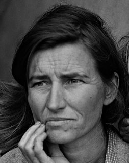
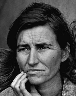
I'm happy to say I've got a really nice little print for the "Print Offer" coming up on Friday. It's a picture I've come to love, and the print is a little beauty, a little gem. Unlike the offering on the 15th, it's not something anyone will already have. If you're a baseball fan at all, especially, keep alert. There was a tiny little controversy—not even as much as a tempest in a teapot—over my decision to offer a fine print of Dorothea Lange's "Migrant Mother" two weeks ago. A few people worried it might not be legal (it is) or ethical (it is) and a few others opined that it wasn't quite the right thing to do anyway (I disgree, but hey, fine, they're entitled).  John C. H. Grabill, Red Cloud and American Horse (Click on the image to see a larger version) John C. H. Grabill, Red Cloud and American Horse (Click on the image to see a larger version)The thing is, pace Ansel Adams, a print really is a performance. Take a look at this pair of pictures. The photograph is by John C. H. Grabill, and it's entitled "Red Cloud and American Horse, the Two Most Noted Chiefs Now Living." That was in 1891. Ansel said the negative is the score; in this case, the score is a TIFF filed downloaded from the Library of Congress website, which is on the right. On the left is a small JPEG of an in-progress file I've been working on to make a print out of. It's not finished yet. It may not get finished, either: the TIFF file is a so-so scan of an old, damaged print. The print, like most photographs, was not particularly well-made in the first place, and it shows all sorts of defects: water damage, metalizing, discoloring, fading, and a maddening number of flaws—some in the original negative, some in the original print, some in the scan, some not showing up except in my contrast-enhanced rendering of the scan. I worked on and off for two days on spotting the #$%! thing. There's still some left to do. Now, I suppose, one could ask just what the heck it is I'm doing, and what it is I'm making. It's not an original anything, certainly. A restoration? A pointless little prettied-up pictorial simulacrum of the original? Maybe you like the charms of the original in all its damaged glory—fine, but remember, you can't have the original. It's in the Library of Congress collection. All you can have is a digitized TIFF, or a reproduction print made from something like the version on the left, whether you let me do all the dirty work or you do it yourself. So would you make an inkjet print of the file on the right and hang it on your wall? I don't think I would. (I might hang the original, if I could.) What I think I'm doing, anyhow, is this: printmaking. I like printmaking. I like it because I like to look at prints. If I spend five hours of my life re-working a nasty old TIFF from the LoC, it's because I like the picture and want to look at it more often, that's all. The argument could also be made that what's being done is rescuing. Sure, nothing you can download from the LoC website is literally in need of rescuing—except perhaps from obscurity, from being overlooked, forgotten. (Had you ever seen Grabill's portrait of Red Cloud and American Horse before? I hadn't. I've known about and admired Red Cloud for a long time, though.) There are tens of thousands—hundreds of thousands—maybe millions of fine old photographs languishing in archives, museums, libraries, historical societies, and estates all over the world. I could work for the rest of my life on making prints of pictures just from the LoC collection, and never make a dent. Why not resuscitate a few nice ones for a frame on the wall of a few of the more discerning households here and there? So, you're saying, fine and dandy—but what the heck has all this blather got to do with "Migrant Mother"? It's a very famous photograph and doesn't need rescuing from anything. The answer there is...well, not to be immodest, but I'm good at this. Not the best, mind you—I'm not that immodest—just very good. At printmaking, I mean. And this is where interpretation comes in. I like interpreting pictures as prints—performing them, Adams would have said. Running them through my own aesthetic filter, putting my stamp on them, eking out their expressiveness, finding the balance I think is just right. Let's take Migrant Mother, for example. I'm going to exaggerate these two details, to make my point, but I think you'll see what I'm talking about.  Take this detail first. It's Florence Owens Thompson's face, rendered in fairly low contrast. Now look what happens when I increase the local contrast:  The change is slight, and either one works fine technically. But the higher contrast version changes her expression. Are you seeing that? Yes, it's the same exact information—but it feels subtly different. Look at them together. In the top picture, she looks more resigned, forebearing. In the bottom one, she looks more worried, more anxious, maybe even a touch angry. It's easy to analyze why: the higher local contrast emphasizes both the lines in her forhead and her upper lip. By darkening the upper lip, her frown is emphasized; her mouth in the top picture could almost be of a mouth in a resting attitude, whereas the bottom one seems more like an active expression, actively displeased. And bringing out the lines on her forehead makes her worry more exaggerated. It's a subtle thing, but it's definitely something any viewer would sense in looking at a fine reproduction. This isn't a technical issue at all, really. It's pure interpretative. In making a print I'm not thinking how I want the contrast to look, I'm thinking "what makes her expression the most eloquent?" I don't want to overcook the local contrast on her face, because then, sadness and worry overwhelms stoicism and forebearance, and you don't want it to. All those elements should balance: it's what give her face in the picture such tremendous richness. It's not just a matter of the contrast, it's a matter of the effects of the contrast. In my version of Red Cloud and American Horse, for instance, I'm just not feeling the cold and the wind of the prairie quite as much as I do from the original. It seems a little too flat, a little too pretty. Is it too brown? I'm going to have to figure that out. Well, anyway—maybe now you'll understand when I tell you that I've been agonizing all day over whether to make the final version of Friday's print five inches wide or five-and-a-half inches wide. Slightly smaller, and it has more of a gem-like quality (I even like it smaller still; it works). Slightly larger, and you see just slightly more film grain, which I like. But a little more sharpening shows the grain too. Gotta find that perfect balance where everything's just so and the whole thing sings.... Posted by: MIKE JOHNSTONFeatured Comment by Robin Dreyer: I don't see any ethical problems here—I'm just glad to see someone recognizing photographic printing as printmaking. I love to print—I have friends who are printmakers in the classical sense (i.e. etching, litho, etc.), and I've always seen a connection between what they do and what I do. I also supervise the printing of publications, and when I work with printers, I'm aware that they, too, are printmakers. What ties these things together is the shifts and the interpretations that happen when an image is translated from one material to another. It's printmaking.
 Toby Melville, Heathrow Airport, London (Reuters) Toby Melville, Heathrow Airport, London (Reuters)Hope the Christians among you had a nice celebration over the past couple of days, and that you haven't made yourself look like—or feel like—the poor soul in Toby Melville's picture above (as my friend Gabi wrote from Chicago, "I think I have eaten my body weight in cookies in the last week or so." She's a competing triathlete, though, so she earns her cookies.) Here at T.O.P. we've got some nice pointless fun planned for the next week or so. Amongt other things, I'm about to embark on a series of 2006 Awards. Now, why would a blog give awards, and who cares? I just happen to think it's fun, is all, although I detect a didactic imperative in calling attention to some deserving books and people, which I always like to do. Anyway, we're starting with the "Camera of the Year," below, and will culminate in the "Photographer of the Year" on New Year's Eve or New Year's Day. Hope you find something of interest in the array, and, if not, there will be other things mixed in, too. And I think I've got a really neato print offer lined up for this Friday. Keep comin' back. Posted by: MIKE JOHNSTON
T.O.P. Camera of the Year 2006: Nikon D80
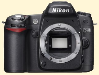
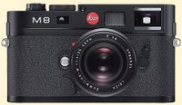
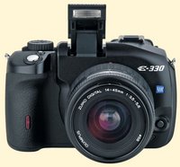
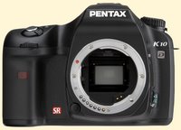
 WinnerNikon D80 WinnerNikon D80 (introduced August 9)—Despite stiff competition, the Nikon D80 nosed out in front of the pack as the best all-around camera introduced in 2006. More than a mere upgrade of the popular and competent D70[s], the up-to-the-minute, 10-MP D80 is a careful and thorough all-new design, with superb Nikon ergonomics in a body that is even more ideally sized and shaped than the D70. Nikon is on a roll with its outstanding recent camera designs, and continues to win points among camera buyers—and plaudits from the likes of us—for its unstinting downward migration of features and capabilities from its more professional models: the D80 inherits a surprising amount of technology from the D200, which in turn provides a surprisingly large dose of the capabilities of the full-tilt-boogie D2Xs. Build-quality is a cut above for the price-point (the Sony A100 and Canon Rebel XTi feel flimsy in comparison), responsiveness is excellent, and, importantly, there is evidence in the D80 that Nikon is giving serious consideration to the viewfinder, which remains a serious if somewhat under-criticized weakness of many entry-level DSLR designs. Although some (not us) may fault the D80 for having an APS-C size sensor, and others (including us) might still wish for in-camera VR (vibration reduction) at least as an option, the D80's astutely-judged mix of high image quality, responsiveness, ergonomics, and in-the-field usability mark it, if only by a small margin over its capable competition, as the year's standout. Runners-Up  Leica M8 Leica M8 (September 14th)—Although plagued with early problems, the first digital Leica M is an important bridge to the past, a much-needed rangefinder alternative to the SLR-name design that's becoming ubiquitous, and a step forward in terms of applying traditional controls and very high mechanical build quality to serious modern digital cameras. That it can be used with most Leica (and other M-mount) lenses is exciting and a huge plus.  Olympus E-330 Olympus E-330 (January 26th)—The compact consumer 4/3rds DSLR is the first to offer full-time live preview on its LCD screen. Although not sufficiently appreciated by some reviewers, this is a feature that many photographers miss when switching from digicams to DSLRs. Olympus continues to lead the way when it comes to thinking creatively about digital camera design.  Pentax K10D Pentax K10D (September 13th)—The first pro/semi-pro body from Pentax in many years and the first semi-pro DSLR from the company, the beautifully sculpted and very well-made K10D earns our admiration for its in-the-body SR (shake reduction), anti-dust mechanism, accessory grip, and weatherproofing—the only current 10-MP DSLR with all these features—and it gets extra points for its accompanying set of very useful, designed-for-digital compact primes. Tomorrow: T.O.P. Technical Book of the Year 2006 Posted by: MIKE JOHNSTON, with thanks to dpreview.com for its "timeline" of new camera introductions
 Photo by Jodi Cobb (National Geographic) 2001 Photo by Jodi Cobb (National Geographic) 2001T.O.P., which publishes 363 days a year, is officially on hiatus Dec. 24th and 25th in observance of Christmas. See you on the 26th, when we will begin our countdown to January 1 with our Offbeat, Indefensible and Highly Unofficial Best of 2006 Awards. (We're taking the two days off to try to think up a better name for the awards.) In the meantime, Merry Christmas* one and all. Posted by: MIKE JOHNSTON*Or Happy Hannukah, Season's Greetings, Good Kwansaa, Grievous Festivus, or any holiday salutation of your choice—whatever, we wish you and your loved ones luck, health, good cheer, togetherness, blessings, contentment, and long life.
I know a lot of readers of this blog are a lot more computer-savvy than I. With CS3 hull-down on the horizon and my hard drive full, it's becoming obvious that my sturdy old eMac is getting due for an update. Any expert opinions on what Mac a photo-stylin' cheapskate should buy at this point in time? Used or new? Mini or iMac? G5 or Macintel? Two-piece or all-in-one? One Gig or two? I'd sure appreciate input from wiser brains. Posted by: MIKE JOHNSTONUPDATE: THANK YOU for all the great replies. The strongest consensus recommendations seem to be: a) Wait until after the MacWorld Expo; b) Get a Core Duo iMac (with 20" being the main recommendation, 17" to save money and 24" for a "dream machine"); c) Go for 2GB of RAM minimum. With weaker but still prevalent recommendations being: 1) Choose the Core 2 Duo (I'm not quite sure what this refers to, but I'll find out); 2) Seek out a refurb, or an educational or employee discount to save money. Bruce McL points out, "Since you have an eMac, you'll be pleased with the performance no matter what you get." I agree, although have to admit that the eMac has been the best computer I've ever owned—the monitor is beautiful, with very accurate color (albeit with the benefit of frequent calibration) and the box has been largely trouble-free. Just as a curiosity, I might mention that I learned to use computers on some of the very first Macs ever sold, original 128k Macintoshes, which I was using even as the original "Big Brother" TV commercial still ran over network TV (or so I thought, anyway—my memory may be of re-runs of the commercial on news and information programs). A gallery owner named David Adamson bought six or eight of them for the Corcoran School of Art in Washington, D.C. where I was a student (thanks again, David, wherever you are) and taught a course in computers that I took as an elective. My parents then bought me a 512k "Fat Mac" as a graduation present when those were the latest thing. That "Fat Mac" and its dot-matrix printer, which I believe was called an Imagewriter, is still the most expensive computer I've ever owned, although I believe it had less computing power than my current digital SLR. I've had one-piece Macs ever since, with the exception of a G3 desktop I used at home for two years that belonged to an employer (it was probably the worst Mac I've ever used). For most of my tenure at one job I used a Quadra 604 in the office. It wasn't even new—I inherited it from a predecessor. That Quadra 604 failed exactly once—when the battery on the motherboard that kick-started the monitor ran out of juice. Apart from that, it worked for me 9 hours a day, 5 days a week for five years without so much as a single crash or screen-freeze (when I'd say that to PC users of the era, they look at me blankly and blink rapidly, about like you'd look at someone with a serious mental defect that had just become painfully evident. Such a thing did not compute with them. But it was true.) My next one will be my seventh Apple Mac since 1984.
Cool! Anyone ordering gold media from Encore Data Products from this site can get an extra 5% discount by using the special T.O.P. coupon code " TOP5." Just click on the link, or the Encore Data "GOLD Archival CDs and DVDs" ad at the left, and then remember to enter the code when you check out, and the discount will be applied to your order. There's no maximum order limit, either. Cool. Posted by: MIKE JOHNSTON with thanks to Jeff B.
by Carl WeeseReaders have been asking for word on my new camera's Shake Reduction function, so here it is: It works. But how well it works, how many steps of shutter speed it buys you compared to your unassisted hands—that is turning out to be a difficult thing to determine. Between my own tests (which come out slightly different each time I repeat them) and tests of other shake systems I've looked up online, I am forming the conclusion that this feature may be impossible to evaluate objectively because it is in fact user-dependent. Specifically, I think that if hand-holding slow shutter speeds has always been a problem for you, this feature is going to make your day, or even your year. But if you were already really, *really* good at this form of photographic sharpshooting, you'll see a much more limited benefit. A benefit to be sure, certainly a full stop, which is nothing to sneeze at.  Above, a picture taken at Hidden Valley in very dim light at 1/6th second, handheld. Above, a picture taken at Hidden Valley in very dim light at 1/6th second, handheld.
Below, a center crop from the same file. So stay tuned; I'll report more when I have a better handle on this. In the meantime, I'd like to hear from anyone out there who is working with an anti-shake system. How many stops do you think your anti-shake system is buying you, under what conditions?
I don't want to distract commenters from Carl's question, but another idea regarding Shake Reduction came up in conversation last week with the guys at my local camera store. Unlike Carl, who was an expert competitive archer in his youth, I have always had trouble with hand-holding slow shutter speeds. In fact, I think I suffer from a form of what golfers call "the yips": a certain spasmodic tension that occurs just as I will myself too consciously to be calm—a tendency to get "shakey" precisely when—indeed, because—I'm trying not to. This isn't something arcane—I can feel myself doing it, and observe it in the viewfinder. Oddly, this has shown up for me twice in objective camera-motion tests—but in an unexpected way. In the 1980s, following instructions in a Popular Photography article by Burt Keppler, I poked holes in a large sheet of black cardboard and lit it from the back, creating "points of light" that would show motion-blur very clearly. I then shot the setup with a variety of shutter speeds. I ran another camera-shake test in outdoor conditions using ND filters with a Canon EOS RT in the early '90s. In both cases, strangely enough, I did very well at hand-holding—in the second test, in fact, I was rock-solid to a half of a second! This is greatly at odds with my long experience as a photographer: I know I have trouble hand-holding 1/30th, and once, when shooting a perticularly upsetting assignment (the accident scene of a young black professional who had committed suicide by jumping from a bridge in Washington, D.C.), I had trouble hand-holding 1/125th. (Appallingly, the young man had jumped from right beside a non-working suicide hotline phone.) So what accounts for my performance on both tests? I think it was simply that I was perfectly relaxed. Because there was no picture, there was no pressure. Because there was no pressure, I was able on those two occasions to hold the camera steady at shutter speeds I am absolutely sure I can't hand-hold in real life. So what does this have to do with Anti-Shake? Simply that this camera feature also helps make my "yips" go away. I don't worry any more about whether I can hand-hold a 30th, because I know the technology is helping me. So I relax—and hold the camera steadier. This probably makes the technical feature work better for me, and increases the improvement the feature gives me. If I'm right about it—and I'm pretty sure I am, though only in my own case—it also underscores Carl's suspicion that the real, practical, in-the-field effect of anti-shake systems is not really possible to measure with perfect objectivity. Posted by: MIKE JOHNSTON
by Ctein Two posts ago I showed you the innards of this cheapo wonder. So can it make pictures?! Well, yes, after a fashion. But first, some warnings. • There's not enough smarts in this camera for it to look like a regular USB storage device, so you need special drivers to download the photos into your computer. The camera only comes with drivers that support recent flavors of Windows. Mac users are likely out of luck. I've had erratic results under Virtual PC. You ought to be able to use a Macintel that's booted into Windows. • Photos are stored in 2 MB of SDRAM, which requires constant power. If anything interrupts the power to the camera, your photos are trashed. The RAM sucks down the AAA battery even when the camera's off. A fresh alkaline battery lasts at most three days, sometimes considerably less. Once it dies, forget about retrieving your photographs. I lost a helluva lot of photographs before I figured that out. I finally started getting reliable results when I got to the habit of downloading the photographs as soon as I got home after making the photographs, preferably the same day. Remember to take the battery out of the camera as soon as you've successfully downloaded the photographs. Otherwise, it won't be very long before you've spent more on replacement batteries than the camera cost! OK, finally we get to the photographs! I can't decide if they're really lousy or surprisingly good. Whatever, it's fun. My friends get a real kick out of seeing me with this. As I joke, "Yes, it looks just like a camera...only smaller." You'll get best results with subjects that don't have a lot of important fine detail; a bit of sharpening can really help.  Pictures from the $10 digicam are helped by a bit of sharpening. On the left is the straight photograph; on the right it's been sharpened with Focus Magic. All the other photos in this column were sharpened using Focus Magic. There are only 288 x 352 pixels to work with, and that ƒ/2.8 lens quality isn't going to cause Zeiss to lose any sleep, especially at the edges:  Fine detail is not this camera's forte, especially outside of the center of the field of view. Observe how smeared the Christmas lights are. Photos taken in moderately bright light are pretty clean...  In medium bright light the $10 digicam does pretty well! ...although the sensor tends to blow out in direct sunlight. The camera does amazingly well under dim indoor light; the on-board circuitry just keeps upping the gain until you get a usable, albeit very noisy, image. I've had a lot of fun figuring out tricks for cleaning up those low-light photos.  I made this photo at a dimly-lit Christmas party. The $10 digicam amplified the signal enough to produce a decent exposure, but image noise went right through the roof and the color's awful (upper left). Figuring out how to clean up this photo was fun! First I upsampled it by 2X and ran it through Neat Image, which did an amazing job of eliminating the noise (upper right). Next I applied Digital ROC (lower right) to restore the color. Finally I used Focus Magic to restore the fine detail that Neat Image had smeared out (lower left). A masterpiece, no? What's on my wish list for the next generation? How about non-volatile storage and a little LCD on the back so you can get some idea of what the picture looks like, since the camera's viewfinder is nearly nonfunctional?  The $10 digicam has a nearly-nonfunctional view finder. Composition is hit-or-miss; this one came out pretty close. It's really a shame there's no way to see what you're actually photographing until you get the camera home and plugged into the computer. Happy holidays, and maybe you'll find of these little wonders stuffing your stocking!
|
|
 In 2006 we were treated to what passes for a controversy in contemporary photography. Greenberg, a commercial studio portraitist from Beverly Hills—she had previously gotten attention from the art world for a series of beautiful studio portraits of monkeys and apes (right)—made a small series of pictures of young children crying. (A small exhibition catalog was published called End Times.) A blogger named Thomas Hawk (a pseudonym—his real name has been "outed," though I don't see any reason to repeat it here, since bloggers have a right to present themselves as they wish to be presented) wrote an inflammatory protest about the pictures, making charges of child abuse, among other things, and the argument has simmered incessantly from the blogosphere to the New York Times Magazine, including criticisms ranging all the way to death threats against Greenberg (that's a bit much) to outraged defenses of her by the owner of her gallery and her husband, some of which were later withdrawn.


 2 ... 2 ...


