|
|
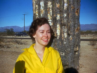
 History has left the Mystery Woman a little fuzzy in more ways than one. History has left the Mystery Woman a little fuzzy in more ways than one.T.O.P. reader Stephen Edgar, from Ireland, recently encountered a mystery. He purchased a bag of old Kodachrome slides, and found to his surprise that most of them were pictures of the same attractive young woman, from more than fifty years ago.  Who could she be, he wondered? As many snapshots do, the old pictures do have a certain amateurish charm. "Like most Kodachromes they've stood the test of time with little fading," writes Stephen. "I've dated the slides to 1952, using the mounts as guides. I wonder if T.O.P. readers would fancy a little detective work to see if anyone (particularly U.S. viewers) could give me any clues as to where this person might have lived, who she might be, and what happened to her. And how did these pictures end up in Ireland?" Indeed...it makes you wonder. A divorce, with the pictures discarded by the ex? Theft, or some other form of loss? Or just a old person's memories, unclaimed by heirs? It's probably unlikely that the subject of these old pictures will be identified, but it's an intriguing mystery nonetheless. "There is little to go on," Stephen admits, "but maybe someone could see something I can't. If nothing else they are lovely pictures—and that's what photography is all about." Posted by: MIKE JOHNSTON
This is actually kind of exciting, in a totally pointless, arbitrary, time-wasting kind of way...last month we exceeded 300k hits (total page loads) for the first time, and this month I was wondering if we'd exceed 350k. That's the number I pulled out of a hat when I was writing the new Introductory Page a few weeks ago. Well, here we are, down to the wire, 7:07 p.m. on January 31st, and the monthly total for hits this month stands at 397,549, only 2,451 away from the Big Numbah. It's already a record; but are we going to make 400k hits before midnight? Tough to tell, but it's entirely possible. See what fun you can have with a blog? Posted by: MIKE JOHNSTONUPDATE: We hit 400k for the month with half an hour to spare—by midnight, the official number was 400,248 hits in January. Cool! (Yes, I know it's silly, because round numbers are just accidents of our base ten numerical system, dependent on the fact that we have ten digits on our hands. If we had eight fingers on each hand, we'd count in hexadecimal, and we'd understand binary better, and computers would have been invented sooner. As you probably know, there are only 10 kinds of people in the world: those who understand binary and those who don't. <*Rimshot*>)
One of the side-developments of inkjet printing is that micro-industries have sprung up to print your pictures on anything from cakes to paper cups. Of all of them, this is arguably the most delicious. Posted by: MIKE JOHNSTON, tip o' the hat to Oren
 Engineers at UC San Diego have built a powerful yet ultrathin digital camera by folding up the telephoto lens. This technology may yield lightweight, ultrathin, high resolution miniature cameras for unmanned surveillance aircraft, cell phones and infrared night vision applications. The Applied Optics paper is set to be published tomorrow. The first author is Eric Tremblay. "This type of miniature camera is very promising for applications where you want high resolution images and a short exposure time. This describes what cell phone cameras want to be when they grow up," said Joseph Ford, a professor of electrical and computer engineering at UCSD's Jacobs School, and who leads the camera project within UCSD's Photonic Systems Integration Lab. Read more at the link. Posted by: MIKE JOHNSTON with thanks to Kevin
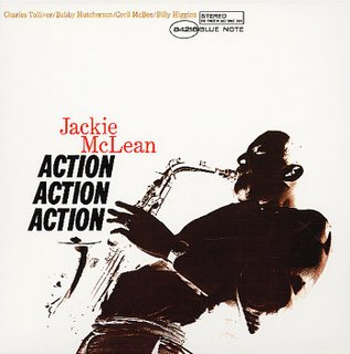
If I've seemed crankier than usual lately, it's because of two things. First, I'm in the middle of having a lot of serious dental work done. This feels like paying dearly to be tortured, which makes it bad in two ways. Having more than one dimension to a bad thing makes it feel worse. Right now, for instance, I would really like to take a nap, but instead I have to go get a root canal. Somehow, the fact that I can't take a nap makes me feel even sorrier for myself than I would normally be feeling just on account of the root canal. The other thing is that, only days before I anticipate receiving my new computer, I reached irredeemable hard drive saturation and had to do a major reshuffling of files, and in transferring my music from one drive to another I managed to delete half of the music I own. I heard that gasp you just made. It wasn't even really my fault*: IDIOTIC iTunes decided that every folder with an identical artist name was a duplicate file, as if no one would ever own more than one album by any one artist. I hope this doesn't make me permanently bitter against iTunes. It might.  I'm going to keep backing up my photographs to actual disks. If this blog, and I, ever abruptly disappear and never come back, you'll know that I accidentally deleted my entire photographic archive and have been carted off to voluntary incarceration in an asylum somewhere. (Do they still have asylums? Or do all our mentally ill now live in cardboard boxes on city sidewalks?) Adding insult to injury is the randomness of the accidental deletions...I lost most of my Jackie McLean, almost all of my M. Ward (I'm nuts about M. Ward), Zero 7, Cat Power, much Low, The Fiery Furnaces, all my Bass Communion and Muslimgauze (which I love), and just about every jazz record I've ever downloaded from eMusic...and yet, things that I'll never listen to again, like Kaada, Ciba Matto, and Thievery Corporation, are still insolently sitting there on my drive, perfectly preserved. Like being prevented from napping, this makes the disaster feel even worse than it was. And it was bad. Posted by: MIKE JOHNSTON*Of course, every computer failure that ever happens is the user's fault—that's the only reason why we put up with them.
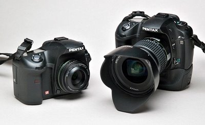
Many people regard a "Grip" on a DSLR camera less as an accessory than as a permanent modification, if not something that just should have been included in the first place. I don't feel that way about it. I recall, back in the dark ages, when my primary working cameras for commercial assignments were Nikon F2's, I thought that the camera with grip/motor module, without the additional bulk of the separate battery pack, would be a much nicer package, if only it would work that way. I never equipped my Olympus E-1 camera with a grip, even though it could certainly have used the increased battery capacity. I preferred to carry two or three spare batteries in my pockets or a camera bag to get through a day of shooting in cold weather, rather than increase the size and weight of the camera itself. So I didn't expect to like the grip that the elves at Pentax sent me to check out. But expectations are meant to become surprises. The K10D grip, once it's on the camera, doesn't feel like an add-on at all. You simply have a different and equally well-balanced camera in your hand. This reminds me of the Nikon F3, which was completely at home in its own skin either with or without the MD4 accessory motor drive. In a clever move, the Pentax grip has slots to store an extra memory card and a remote cordless release in the slide-out tray that holds the second battery. Some DSLR grips use a different, larger, battery than the camera's normal one, while others hold two of the regulars. But all, as far as I know, put those batteries in the grip. To install the grip, you first have to remove the camera's battery, remove the battery compartment cover and stow it somewhere on the grip, and then marry the grip and camera. Pentax has chosen to do it very differently. You leave the camera's battery (and compartment cover) in place. You just uncover a set of electrical contacts, stow the cover on the grip, and screw the thing onto the bottom of the camera. Attaching or removing the grip takes five or ten seconds—about as long as changing a lens. Anyone who thinks of the grip as a permanent item will immediately see a problem here. Every time you need to charge the battery in the camera, you're going to have to remove the grip to get at it. What the hell kind of idea is that? Well, a pretty clever one, at least if you are in the camp that regards the grip as an accessory, not a permanent installation. I'm playing with a 12–24mm DA zoom that the elves sent me. It is a monster. After a few weeks shooting with the compact prime lenses, this thing, especially with it's properly engineered (read big) lens shade, seems to be about the size of my new car. But my early results show it to be optically excellent, and while I was sure I would hate it the minute I laid eyes on it, when I pick up the camera with the grip and the lens mounted, it's all ergonomically perfect. This is no rig for inconspicuous shooting, but it is perfectly balanced in my hands. The combination of a zoom that covers the focal lengths I use for almost all my pictures with enormous battery capacity and a storage slot for more memory becomes a pretty universal axe. Just the thing to go out and spend a day with hunting for pictures. But what if I need to spend the morning doing errands, taking packages to FedEx, and so on, and just want to have a camera along? Look at this:  Same camera, two configurations. The camera on the right is not something to grab and sling over my shoulder when I'm not entirely centered on making pictures. The camera on the left is. The transformation takes less than half a minute. Good idea.
Talk about a pleasant surprise: My friend Bob Burnett was busy reviewing Tortoise's A Lazarus Taxon for our music site when he realized that he had been the cameraman for some of the sequences on the DVD. And in the review he talks a bit about the photography the band used for the packaging, and I realized we had blogged about Arnold Obermatt here on T.O.P. a while back. And when I say we I mean Oren. What it signifies when you emblemize your band with pictures of car crashes, I don't really want to speculate about, but A Lazarus Taxon is a collector's item waiting to happen—if you don't know the band, really fascinating easy-to-listen-to instrumental music in beautifully recorded audiophile-grade sound. At less than $15 for three CDs and a DVD in premium packaging, it's all but free at the moment. Run-don't-walk recommended. Partly for the Obermatt, of course (gotta stay on track...). I bet it will be $150 on the used market in just a few years, if not more. What you call a window. ([Even more] shameless plug:) And while you're at it, check out my little essay on Billie Holiday. (It comes after the Tortoise piece.) Protect yourself from Satin ignorance! (Can you tell I have strong feelings about this?)  Tortoise, by Saverio Truglia Tortoise, by Saverio Truglia
Posted by: MIKE JOHNSTON
  I fell into a habit many years ago that I think has served me especially well. Like the importance of a print-viewing area where you can comfortably display workprints to look at in a leisurely fashion, it's one of those major secrets that hides in plain sight—something many people might do as a matter of course but very few actually do. What is it? Simply a method of paying attention to books of photographs. A quality and a level of attention similar to what you might devote to reading a printed book of text. What problem does it solve? A big one, actually. It's called "closure." Closure is what happens when you're having a conversation with another person and you decide you understand what they're saying, so you stop listening and start thinking about what you're going to say. More generally, closure is what happens when you think you understand something well enough, and don't think you need to understand it any better—so you stop trying. You close down. Unfortunately, photographs are among the things we reach closure on the fastest of anything. We primates are visually-dominant in terms of the sense we favor, and these days we're utterly bombarded with images—on some television commercials (adverts, for your Brits), the bombardment can come at the rate of five per second. Advertising photographs, which are often designed to be slick but simplistic—the better to be immediately appealing—are designed to be "gotten" quickly and easily. And of course many images don't deserve extended attention. All of this conspires to encourage our habits of early, often instant, closure. Like it or not, we can hardly help approaching pictures that way: scanning, appraising, closing down, moving on. We spend all day dismissing things.  Here's how I reverse that. When you get a monograph (a book primarily of plates—i.e., of pictures) that you want to "read"—that you really want to digest—first, page through it as you normally might. On that run-through, note where the bits to read are located. Then read whatever those things are—the essay, a preface, an afterward, whatever. Then wait. Wait a few hours until that evening, or wait a day or two. Set aside some time. Make sure you're feeling relaxed, rested, and that you're in a comfortable chair, in a place with decent lighting. Try to see that you won't be disturbed. Put music on if you want to, or not if you don't. And get an egg timer. What? Right, an egg timer. Something that counts off three minutes. (Preferably one that doesn't make any distracting noise, although a low reminder at the end of the three minutes might help.) Five minutes works too. What you do is to use the egg timer to help you spend time looking at each picture (or "spread" of two pages). During that time, let your eyes stay on the picture. Your mind can wander if you want, but keep looking at the picture. After the time is up, turn the page. Keep at this just as you'd read a novel—for as long as you want to, or until you get tired of it. If you haven't "finished" the book, mark your place and come back to it later, and resume where you left off. After you've "read" a book like this, try coming back to it later, after a few days or a week or two, and either page through it again slowly or "read" it again. While you're "reading" the book, don't think you need to be formulating language about it, or thinking large, "front-brain" thoughts. The eye and the brain are constantly working together to dismiss images—glancing, gathering in the gist, registering the information, appraising, moving on. Just keep your eyes on the pictures. Let your mind go wherever it wants to. Looking is enough. And look at all the pictures. Don't be judgmental. Part of what the exercise does is to relieve you of your appraising, judgmental mode of approach—gets you over the idea of "I like this one, I'll linger here—nope, don't care for this, move on, move on!" If the photographer liked the picture well enough to put it in her book, maybe you should just take it in like all the rest of them. If you'll just try this with one or two books, I think you'll be surprised how well it works. All it does it to enforce a different "pace" with images than the one you're used to all day every day. It just slows you down and lets you notice more. I find it helps me to "get" what photographers are up to in their work. I'll bet it can open your eyes, too.  Posted by: MIKE JOHNSTON Posted by: MIKE JOHNSTON
A poster with the handle JTFOTO who claimed to have recently served as 5th assistant to Annie Leibovitz had this to say on the L-L forums on Friday: "She has been shooting all her editorial work with Canon 1Ds MII bodies. These have been major jobs for Vanity Fair and various other mags and recently went on a major Ad job that will be worldwide.
 "The TomKat cover was all Canon and the last two or three editorials were all Canon. "The TomKat cover was all Canon and the last two or three editorials were all Canon.
"The last shoot had a Canon rep come by with the new 22MP digi demo body. It is half the size of the 1Ds Mark II. They said they are hustling to make lenses that will work with what this body can resolve. They may even make a new mount again for an entirely new lens design. It won't be out before Phot Show East." So there you have it, the latest uber-kam rumor, from the horse's mouth to the next horse to the next horse and then on to your ear. "Phot Show East" refers to the PhotoPlus Expo 2007, slated to be held at the Jacob Javits Convention Center in Manhattan on October 18–20, 2007. "The TomKat cover" refers to the recent, um, Leibovitz "homage" to Linda McCartney on the cover of Vanity Fair. Posted by: MIKE JOHNSTON, with thanks to K.P.
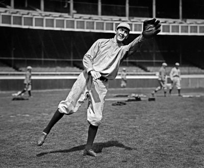
 This fine fellow, about to snag a stinger, is identified as "Scott of New York (NL)." Found him at the L. of C. website. Taken a little less than a century ago, in the late nineteen-aughts. Posted by: MIKE JOHNSTON
 Marcos Vilarino Marcos Vilarino is definitely one of the strangest things I've seen on the web. It's even weirder than this....  Jno Cook, from the Robert Frank Coloring Book Jno Cook, from the Robert Frank Coloring BookI'm not saying I don't like it. Still, it's good to remember all you really need .... Posted by: MIKE JOHNSTON with thanks to Scott Jones
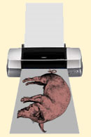
 One last thing about selecting a "pig printer" (thanks to S. Lallement for the image): you don't get any special Brownie points for optimizing your ink investment above all other things. It makes sense to me not to hemorrhage money through the ink carts, especially unwittingly. But, to get the cheapest ink price, is it worth it to buy a printer the size of a bathtub, for which a whole set of inks costs more than a month's mortgage? You can go insane trying to calculate, to the last infinitesimal fraction of a centime, the cost of ink per square inch of printed paper surface. But why bother? Are you telling me you don't waste more money on useless purchases every day, or week, or month? After all, the best way to save money on ink is not to make prints at all, and that's no fun. There are other things way more important in choosing a printer: principally, how well you like the way the prints look. Oh, there are other things...does it take roll paper? How fast does it print (not an issue to me, but possibly to you)? How are the online reports of usability (i.e., does it have issues) and reliability (does it keep on doin' what it does without fuss)? Don't forget to consider how long you'll probably keep it—the last three printers I've owned are now festooned around my house doing impressive imitations of useless junk (for some reason I have a hard time discarding still-working, formerly expensive peripherals). Their current junkyard status was not factored into my decision to buy them in the first place. In other words, my advice is to pursue the results you want, even if it costs you a little money. I'm keeping the HP B9180, and I don't care if the ink price per ml is not the best, because I love black-and-white, and I love the way the B9180 does black-and-white. Is it the "best" for black-and-white? I don't care: I like it best. So okay, the ink costs a little more. But paying a little less for inks when you don't even really like the prints you'll make is a pretty fair definition of foolish. For me, photography is not a way to save money: it's what I save money for. Then again, in the end you'll probably do your shopping like everyone else: judiciously consider all the pros and cons, and then go right ahead and buy whatever you want the most. Nothing wrong with that. Posted by: MIKE JOHNSTON
A couple of commenters to the previous post have hit one nail squarely on the head, which is that when considering a pigment printer, you need to consider a number of factors relating to ink. For each of the printers listed, it would be useful to come up with the hard numbers for the following: 1) number of inks each printer uses 2) amount of ink per cartridge 3) cost per cartridge 4) ink cost per ml. 5) cost of a complete set of cartridges For instance, I don't think the number is published, but I believe that the Epson Stylus Photo R2400 uses ink cartridges with 14 ml. of ink per cart. (I have a notoriously bad memory for numbers; I'm recalling a conversation with an Epson rep several months ago). The Stylus Pro 3800 uses carts with 80 ml. per cart. Looking up the cost of the respective ink cartridges on the B&H website, it's $13 for an R2400 cart and $55 for a 3800 cart. While that's considerably more money for the latter, the cost per ml. is 93¢ for the R2400 and only 69¢ for the 3800. The HP B9180 uses $32 carts with 28 ml. of ink per cart, for a per-milliliter cost of $1.14. The Canon ipf5000, a more expensive printer, uses carts with 130 ml. of ink per cart that cost $75, for a per-ml. cost of 58¢. Cheaper even than the 3800, but not by all that much. Into that equation, how important it is that the HP B9180, for example, takes 8 inks, for a total cost of $256 for a complete set of inks, while a complete set of 12 iPF5000 inks costs $900? Presumably, you're going to get more mileage out of a set of inks with more carts per set, so you'll have to replace them less frequently. So these numbers aren't a direct comparison, and that difference not quite as dramatic as it sounds. A complete 3800 inkset costs $495 (9 carts at $55 per cart). Lastly, you need to consider how much printing you do. Presumably, the less printing you do, the more sense it makes to get a printer with a lower unit cost and a lower per-cartridge cost, even if the cost per ml. of ink is higher. After all, you don't realize the savings for larger carts if you're not going to use them up. Or maybe a better way of putting that is, the savings aren't going to be as significant if you only use a few sets of cartridges over the service life of the printer. (However, apropos my main recommendation, it's a poor economical choice to spend an hour or two of your life making a beautiful print that's going to fade in a couple of years. My early dye inkjet prints are fading unacceptably already, and I wasn't a particularly early adopter. Pigment inks and good papers are where it's at.) Posted by: MIKE JOHNSTON
Although I've endorsed specific products from time to time, I don't often come out in favor of one method of doing anything. My basic philosophy with regard to photography enthusiasts is that everyone is allowed to have fun with photography any old whichway they want to. If you like to make d.o.f. charts for all your lenses…if your goal is to collect profiles for every paper you can buy…if you cannot rest until you own every Photoshop book…if your thing is toy cameras…if you enjoy darkroom experiments designed to maximize film grain…if your life's work is shooting portraits of blond people…if you haunt flea markets looking for old Kodak Instamatic pictures for your huge and growing collection—I say, knock yourself out. (And lest you think any of these are unreasonable examples, I know of real people who pursue each and every one of these aspects of the photography hobby.) I don't advocate or condone hurting people or breaking laws. Beyond that, it's up to you—have fun, don't limit yourself, and don't feel beholden to conventional value judgments on what you personally prefer to do. However, I really believe that if you're a serious photographic inkjet printmaker, you should use a pigment ink printer. Again, you're free to interpret that key phrase, "serious printer," any way you please. If you're happy with your dye-based inkset and inkjet printer, no need to defend yourself to me—I'm happy to assume you know what you're doing and that only you know what's best for you. Walk on, bro. Live and let live. But pigment inks have reached "mainstream" status. Their usability has improved greatly; their gamut is now more than acceptable; their early problems have been ameliorated by technical development; their advantages in terms of print life expectancy (LE) are undeniable; they look best (again, IMHO); and competition has provided end-users with an acceptable number of alternatives to choose from. Here's a list of currently available pigment ink printers. I'm hoping if you see any mistakes or omissions, you'll let me know. I'll try to update this list with the number of inks each printer uses, too. Epson
 Epson R1800 Epson R1800
Inkset: UltraChrome K3 pigmentPrinters:Stylus Photo R2400 (consumer, 13-inch wide, desktop, $760) Stylus Pro 3800  (consumer/professional, 17-inch wide, desktop, $1,300) Stylus Pro 4800 (consumer/professional, 17-inch wide, desktop, $1,655) Stylus Pro 7800 (professional, 24-inch wide, stand-mounted, $3,000) Stylus Pro 9800 (professional, 44-inch wide, stand-mounted, $5,000) Inkset: UltraChrome pigmentPrinters:Stylus Photo R1800 (consumer, 13-inch wide, desktop, $450) Stylus Photo R800 (consumer, 8.5-inch wide, desktop, $365) Canon
 Canon iPF5000 Canon iPF5000
Inkset: Lucia pigmentPrinters:imagePROGRAF iPF5000 (consumer/professional, 17-inch wide, desktop or stand-mounted, $1,400) imagePROGRAF W6400 (professional, 24-inch wide, stand-mounted, $3,555) image PROGRAF iPF8000 (professional, 44-inch wide, stand-mounted, $6,000) image PROGRAF iPF9000 (professional, 60-inch wide, stand mounted, $15,075) Pixma Pro 9500 (announced, not yet available, inkset not yet determined) Hewlett-Packard
 HP B9180 HP B9180
Inkset: Vivera pigmentPrinters:B9180 Photosmart Pro (consumer/professional, 13-inch wide, desktop, $540) Designjet Z2100 24 inch (professional, 24-inch wide, stand-mounted, $3,283) Designjet Z2100 44 inch (professional, 44-inch wide, stand-mounted, $5,493) Designjet Z3100 24 inch (professional, 24-inch wide, stand-mounted, $4,300) Designjet Z3100 44 inch (professional, 44-inch wide, stand-mounted, $6,631) Posted by: MIKE JOHNSTON
Andy Adams has been working with Flak Magazine to develop its photography section and has been publishing a photography blogzine featuring work from an international community of photographers since November 2004. This summer—after a few months hiatus—he relaunched a redesign. Some thoughtful and well-chosen links. Posted by: MIKE JOHNSTON
Marc Garrett's since1968 blog has just published a fascinating interview with Mark Hamburg, Adobe's lead developer for the Lightroom project. Among the many fascinating tidbits of information is that the best current estimates for Lightroom coming out of beta are wrong, and a frank acknowledgement that Apple's Aperture release "certainly raised the pressure to ship Lightroom." Recommended reading if you're at all interested in keeping up with the Aperture/Lightroom apps. Posted by: MIKE JOHNSTON
Easily our most popular post ever, published way back in June—seven months ago almost to the day. Who would have guessed that it would take until today for it to get its best comment? Number 107, no less! Check it out, and thanks to "The Great Unwashed." Posted by: MIKE JOHNSTON
My brother called me yesterday. He couldn't see any reason why his picture appeared, twice, in the post entitled "Do Phototgraphy Websites Need to Grow Up?", so he figured I was testing him, to see if he means it when he claims he reads my blog every day. Well, I wasn't testing him, but if I had been, he would have passed. A+, Scott. So I figured I'd do a real post about him. As some of you may know, Dilbert (using the pen name "Scott Adams," but don't be fooled—his real name is Dilbert) writes a daily blog, and recently he posted an item about "Car Singers."  Scott Adams Scott AdamsHere's how to get back at car singers. Wait until you have them in the passenger's seat on a warm summer day. Ask them to roll down the window. Wait until you come to a stop light with another car on your right that has its drivers-side window down. Abruptly, lean across your friend, and scream, "BLEHHHH! LOOK AT ME!" then quickly turn away and look nonchalantly out your own window. Invariably, here is what happens: Your friend in the passenger's seat looks out his window to see who you were yelling at. The person in the next car looks over at your car to see who was yelling at him—and assumes it was your passenger. Just as your passenger realizes this and starts to try to explain, the light turns green, and you pull away. At least, that's how it used to work when my brother Scott used to do it to me. Posted by: MIKE JOHNSTON
By CteinAbout thirty years ago I was hired to illustrate an article on the big cats at Africa USA, a local theme park. This is the kind of assignment I love. I get along well with many animals (not all that fond of dogs, though) and I do especially well with both cats and birds (maybe I should get a job as a peace negotiator)—they both love me, just about without exception. Here's the situation. Between rolls of film I'm sitting on a bench next to one of the trainers, making notes. A cheetah is there. Paper, pen, writing, cat deciding it's not the focus of attention (same old story). It lays down next to me, plops its head down in my lap and starts purring loudly. It's a pretty heavy head; think of your average house cat scaled up by a factor of 5–10. So to better distribute the weight, I slip my left hand under the head to cradle it and start scratching the cheetah behind the ears with my right hand. Cheetah is in bliss, and I'm pretty damn happy. This is all cool; it's found a new patsy, and I have a 70 lb. lap cat. After fifteen or so minutes of this my left hand is getting a little tired holding up the cat's head; my right hand is definitely showing evidence of fatigue. Gently I lower the cheetah's head back onto my lap. It decides that is okay. I slowly ease up on the scratching behind the ears and after another minute take my right hand away . Cheetah keeps purring for another 15 seconds, then stops. Thinks for several seconds. Then, without bothering to look up, the cheetah languidly raises a forepaw and goes SWIPE two inches from my ear. I hear the swoosh, feel the wind; it's a Kodak moment. Cheetahs do not have retractable claws. I resume scratching the cheetah behind the ears, the cheetah resumes purring, and order is restored. Eventually I was rescued by the trainer. Otherwise I would still be there, scratching a happy, dominant cat behind its ears. Contemplate this the next time you think you're having a problem with a portrait subject.  No, this is not my most unforgettable subject. Just a distant relative. No, this is not my most unforgettable subject. Just a distant relative.
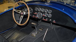
 Click on any of the pictures to see larger Click on any of the pictures to see largerThis is Carroll Shelby's personal 1966 Shelby Cobra supercharged 427 "Super Snake," that yesterday set an auction record for an American automobile, selling for US$5.5 million after a wild and fiercely competitive battle between two determined bidders at Barrett-Jackson's 2007 Scottsdale "Event" in Scottsdale, Arizona.  "It's a special car. It would do just over three seconds to sixty [mph], forty years ago," the 84-year-old Shelby said. "I killed a buzzard with it. Nasty, nasty." The 800-horsepower car once had a twin, built for comedian Bill Cosby but wrecked by a subsequent owner. Shelby said he drove this one around for years. It was purchased by collector Ron Pratt of Chandler, AZ.  If you can't live without one of your own, Superformance builds modern Cobras (minus the coveted name) under license from Shelby—in keeping with tradition, sold sans engine; shoehorn in one of your choice. (Lots of nice pictures at the link, too, if you like that kind of thing.) Posted by: MIKE JOHNSTON
Regarding the post "Do Photography Websites Need to Grow Up?", below, I should probably add that I'm only talking in the abstract. I'm not even remotely considering trying such a thing myself. I could never in a million years pull it off, and besides, the more I think about it, the more I like T.O.P. just as it is. I think it could be slightly improved in terms of its interface, and I might take a stab at that some day, but otherwise the only major change it could undergo would be if someone were to offer me a real job and I'd no longer have time for it. But that's all. For the foreseeable future, I suspect it will go merrily on just as it has been—free, and rather easy. Posted by: MIKE JOHNSTON
By Carsten Bockermann This afternoon I found a book in a Cologne bookstore that is a must-see for all bokeh aficionados: All Day, Every Day by David Armstrong. All the pictures in the book are out of focus in a beautiful, painterly way ( see here for some examples) and Armstrong shows an excellent sense for color. Definitely worth checking out. Posted by: CARSTEN BOCKERMANN
TOP has been an online success story. Its popularity has grown and grown (although I'm aware that it's still a "little" site), and I actually derive income from it in about four different ways—not enough to live on, naturally, but enough to make me pay attention. It's gotten some very flattering press from around the internet, and enjoys many loyal adherents (you, that would be), for whose interest and support I'm grateful on an ongoing basis. I have some doubts about photo websites in general, though. You may be aware that most of the professions—doctors, lawyers, accountants—went through a "sole practitioner" stage, maybe a hundred to a hundred and fifty years ago, very roughly speaking. Each professional, trained as a generalist, rented an office, hung out a shingle, and took in clients off the street. Every individual had to do everything that needed doing, on the practice side and on the business side. Gradually, this evolved into the paradigm of professional groups, where handfuls, dozens, or even hundreds of practitioners banded together—in hospitals or medical practices, or law or accounting firms. There were numerous advantages to such arrangements: specialists could be supported, clients could always be accomodated regardless of their differing needs, business specialists could be hired to handle those aspects of the practice, equipment could be shared, and overhead and shared costs could be spread out among many earners. There are still sole-practitioner doctors, lawyers, and accountants, of course, but for "power user" customers the new model has taken over.  Professional photographers themselves have not really been able to move past the "sole practitioner" model simply because the product is so dependent on the one person's skills. If a client hires Joe Smith, they want Joe Smith to shoot their job—not some lackey from Joe Smith & Associates Inc. The business is dependent on Joe Smith's "eye," so to speak, and there's only one person who has that. This puts a stern limit on growth (as well as on other desirable things, like inheritability). Certain professional photographers periodically try to move on the "professional group" model, and a few have been able to beat the odds and make a success of that, but for the most part it hasn't become common. My notion of photography websites is that we're still mostly in the age of the "sole practitioner"—the single, non-specialist jack-of-all-subjects who runs one little idiosyncratic website and remains king in his own kingdom. This suits the web, because viewers—who actually use things called "browsers," indicating what is ordinarily done with them—can flit about so easily from one place to the other, gathering tidbits from hither and yon. And each "sole practitioner" eventually settles down wherever his or her own abilities and interests lead. So I go to Bythom for Nikon camera reviews, Luminous-Landscape for Canon camera and printer information, photo-i for printer and scanner reviews, photographyreview.com for user's equipment reviews, Steve's Digicams for digicam recommendations, dpreview for DSLR reviews, photoSIG or pbase to look at amateurs' pictures, the Digital Journalist for photojournalism content, a handful of my favorite blogs for entertainment, a couple of different industry sites for news, and so forth. So far, it seems to me that only dpreview and imaging-resource (and perhaps to a lesser extent photo.net, which seems to keep trying but hasn't been very consistent about it) have made any real efforts to expand to become something more—that is, to expand past the sole practitioner stage.  While there's nothing wrong with the status quo, necessarily, there are disadvantages to it. There's no editorial coherence past the boundaries of one site (and sometimes not even within certain sites); there's a whole heck of a lot of noise you have to wade through to get the information you want (especially on forums); and needs are addressed haphazardly—some well, some poorly, some in-between. For instance, there are a lot more digital camera sites than there are options for traditional photography news, and there is almost no place to go for news about major museum shows and exhibits. And, of course, the biggie: atomization encourages fractiousness. Years ago I got hooted off the LUG (the Leica User Group) just because I wasn't willing to swear undying, unquestioning fealty to the automatic superiority of Leicas over everything else (my attitude of "it's just a camera" got me burned at a virtual stake, guilty of heresy). As we've seen in many places, dividing forums according to brands of equipment is just a bad idea. It encourages parochialism, divisiveness, bigotry, narrowness of viewpoint, and an overall shallowness to the discussions that may be convenient in a limited way but is ultimately counterproductive to encouraging an interest in photography as a whole, and deleterious to finding and encouraging a collegial commonality amongst participants. The ideal answer, it seems to me, would be for photographic websites to take a lead from—hate to say it, but—porn sites. In what way? By requiring a monthly subscription fee for access. Before your knee jerks up and hits you in the chin and you cry out, "I hate pay sites!", think about the raw potential for a sec. If the right group of complementary content providers banded together, we could create a "supersite" so good that it would be a mandatory hangout for anyone interested in any kind of photography. If enough people got used to the idea of paying a few dollars a month for access to such a site, the income generated would be enough to compensate each content provider for the loss of the income and control we each now have on our little personal-kingdom sites. We could each concentrate on what we each do best; we could hire an ad salesperson, like any self-respecting magazine; we could have translators creating mirror versions of the site in different languages; we could have an editor correcting our English, and a software genius attending to the interface. And so on. For the web-using photographer, the advantages could be substantial. Imagine a site which cost you, say, about as much a month as a fancy coffee in a really good coffee shop, but that offered you a choice of RSS topic feeds; a lead blog posting all the best, most interesting news from all around the site; a reliable source of pertinent up-to-the-minute information on everything from software updates, to industry news, to current museum shows; correspondents from around the globe; multiple-expert reviews of equipment; tutorials; columnists; articles on who's who; exhaustive, well-groomed links resources; a database of enthusiast book reviews; and original portfolios and photojournalistic stories, actually commissioned by the site and posted on it (I've always daydreamed of the return of LIFE magazine, something The Digital Journalist comes closest to providing now). Want me to go on? I could—but I'm sure you're already thinking up other possibilities yourself. A sort of super-magazine. As I say, I think the site that's coming closest to such a model so far is Imaging-Resource, and they're certainly doing an impressive job, but it's only baby steps compared to what would be possible with real resources to work with, the kind of resources that could come from hundreds of thousands of subscribers from around the world all continuously committed to supporting the same site. It may never happen. Maybe photo websites, like commercial photographers as opposed to doctors or accountants or lawyers, will stay mired in the sole practitioner stage indefinitely; it's possible that it's just the nature of this beast. But I wonder. Possibilities are always fun to think about. Posted by: MIKE ("king in a tiny kingdom") JOHNSTON
Both photos are of my brothers, for no particular reason....
A big congratulations to my friend and colleague Łukasz Kacperczyk on his promotion to Editor-in-Chief of Poland's Fotopolis.pl. (And although I don't know him, congratulations to Michał, too, on his own promotion.) PRESS RELEASE: Fotopolis.pl is the biggest Polish photography magazine—be it on the internet or on paper. It features all the latest equipment news updated on a daily basis, extensive gear reviews, and regular columns by renowned writers, such as everybody's favorite Mike Johnston.* However, we cover not only the technical side of photography. We publish book reviews, artist interviews, critical essays on everything photographic. Extending our reach beyond the internet, we organize workshops and presentations of the hottest new cameras, as well as invite guest lecturers to talk to our readers. Fotopolis.pl is edited by practicing photographers for practicing photographers—amateurs, as well as professionals.
 Łukasz Kacperczyk Łukasz KacperczykFor the last 12 months Łukasz Kacperczyk has been Managing Editor of Fotopolis.pl. This January he assumed the position of the Editor-in-Chief, replacing Michał Sułkiewicz, who moved into management. Posted by: MIKE JOHNSTON
*That's what it said, honest. I've been writing on Fotopolis for a number of years now.
I'm pleased to report that Light Crafts is offering a 10% discount on LightZone 2.0 for any and all T.O.P. readers—all you need to do to take advantage of the offer is click on the ad on this page and use the code when ordering. LightZone was already inexpensive for such a powerful RAW converter with so many unique and useful image manipulation controls. We've long been preoccupied with the distinction between how to do something and figuring out what you want to do, which are really two different problems. For me personally, where LightZone excels is in allowing me to explore my pictorial effects visually in ways I might never even think of trying in other programs. Recently, I've been working on two separate, very different pictures that both came alive only after I experimented with a variety of interpretations in LightZone. I was able to arrive at creative interpretations I would never have seen using other software. Posted by: MIKE JOHNSTONFeatured Comment by Simon Griffee: Some features of Lightzone which I enjoy: • The focus on working with and developing photographs and nothing else. Photoshop has become a behemoth with so many tools and effects for doing anything and everything—you lose your concentration on the image itself. • The ease of creating masks and modifying their feathering so you can develop only certain sections of a photograph. Drawing bezier curves is much easier than in any other software I've tried. • All your editing work on a photograph is saved in a small file (around 100 kilobytes) which is applied and linked to the original JPG/RAW/DNG file, which remains untouched. The harddisk space savings are substantial. Lightzone has a more "tactile" feel to it, an intuitive, visual approach of working with an image. Hard to explain, but if you take a bit of time to try the software, and read a couple of tutorials (such as here and here), you will likely love it. It's the most exciting photographic development software I've used in a long time, and certainly helped give me the confidence to launch my site this year. I encourage you to download the trial and check it out! I also love The Online Photographer—thanks for writing, Mike!
 Mike Johnston, Wisconsin #5 Mike Johnston, Wisconsin #5A small, quiet, dark picture that might appeal to anyone who has ever lived in the north woods, or might like to. The home pictured is an authentic woodstove-heated log cabin. Taken at twilight. The print is very small, less than 6x9, and I think it looks best with a broad, flat, plain, very dark wooden frame coming right up to the edges of the picture (I tried to mock this up in Photoshop to show you, but making it look just right was beyond my skills). This print makes use of a technique that obscures the finest detail without affecting subjective sharpness, but it's very subtly applied and not immediately evident to non-photographers. None of the individuals are recognizable. Richly printed with pigment inks on Hahnemuhle Photo Rag 100% cotton rag paper. Signed on the front and also the back (in case you want to trim it to fit in a flush frame as suggested). Price $65 each for the first seven prints, or as many as are sold today before midnight. ($130 thereafter). Please allow up to four weeks for delivery, although it will most probably not take that long.  Wisconsin #5, Wisconsin #5, $65
Posted by: MIKE JOHNSTON
 I'll have to do this quickly. I just wanted to say thanks to Thom Hogan for including us in "Recommended Web Sites" in his characteristically excellent new " Recommended Products" grid on his website bythom.com. There, okay, done, no more about that now. Just kidding. Out of curiosity, do you agree or disagree with his one complaint? And for the record, his website would make my recommended web sites list, too, if I had one. (I especially love his annual predictions, which we didn't get this year—there's an abbreviated "Nikon Only" version for Nikonophiles, though.) Posted by: MIKE JOHNSTONThom Elaborates: My complaint is more nuanced than the short version posted on my Recommended Products page. I have no doubt that some will subscribe to the "more is better" notion of content for a Web site that they find central to their interests. But TOP is probably slightly tangential to the majority of the audience stopping by (and this is likely very true of someone who finds my site central), and thus the rapidity with which things fall off (or the fact that the page requires a lot of scrolling sometimes) can be problematic to them. Whether you agree with my complaint or not is most likely going to depend upon how often you visit the site. At present, it doesn't support once-a-week visitors well. And for those of us with large RSS lists, the volume of posts also tends to be too high, I think. The issue for Mike is a tough one. Growing organisms are generally healthy ones, and contracting ones are usually unhealthy. Right now Mike is trying to keep TOP in the growing category, and that's where my complaint starts to become relevant: the number of folk that will read everything is likely very finite (and those tend to be the first responders, so that group may be near maximum size). The groups that are tangentially interested but don't want to wade through 10 articles a day are larger and more necessary to the long-term health of the site, I think. It's akin to what happens with magazine subscriptions, actually. You have the core who you can count on, and you have a group that you have to constantly attract and replenish. My complaint is applicable mostly to that last group. One way of dealing with the issue is to "gather" the most recent major articles into a sidebar that always appears. Likewise the "print of the week." Leave off the stuff like the post that provoked this comment ;~) and the other "comments in passing" so that someone who's a casual browser hitting the site doesn't reject it because they see "too much filler." (A lot of stuff in quotes there--I'm not saying there's filler, per se, I'm trying to come with a way of describing the various pieces of material that appears.) By doing that, the less-than-daily site visitor will still see the last dozen or so "serious" articles that they might be interested in without having to wade through every last little post. Likewise, the prints that are still available would continue to be visible. And Mike and Player are right in their assessment: when I criticism something, I try to make it a constructive criticism. I'm a perfectionist at heart (and not one in reality). You don't see me saying "that sucks" or some similar contentless criticism. I try to be precise in what I think can be improved. Sometimes, as in a one paragraph assessment in my Recommended Products, I also have to be concise. Hopefully this comment helped make my comment more clear. Mike Responds: This (and the rest of the comments, for which thanks to the commenters) is of course very interesting to me. I really did "back into" becoming a blogger; I had been preparing a website (it never did get launched) that centralized and collated my photography activites, and there was literally one extra button that I didn't know what to do with. Oren Grad had suggested that I try a photo blog. I began TOP simply to have something to link to that last, unused button. I was as surprised as anyone when it took off. Since talking to David Hobby at Strobist and now hearing from Thom, I've really just begun to toy with the notion of making it into a "real" website—that is, leaving the free Blogger UI behind, hiring a web designer to build a site to my specifications, using multiple pages, and so on. Thus it becomes a design problem, which Thom alludes to. The questions of "What can the site be? To whom? How will they use it? What will encourage further growth and expand the site's appeal past its current core audience?"—all are really aspects of: what do we want to provide and how would it be arranged for optimal access? That stuff is fun to think about—the design aspect, I mean. I like design, even though I'm not the best designer. I like sketching house plans, for instance. So lately I find myself blocking out home pages, inventing ways to accommodate different kinds of content. The question the whole "site design" thing begs is, of course, do I really want it to be any different? Could I handle it? I'm actually already very concerned about posting too much and letting posts go on for too long, and I've been worried about it for some time now. I know people just don't have enough time to read and ponder over every thought that happens to come into my brain. Oddly enough, sometimes it has meant that I don't have enough room on TOP for my own posts. If I've got two or three great things written by other people all going up at once, I don't want to dilute them by posting some rambling little mini-essay of my own. So I end up wanting to write a blog post but not really having a place to do it—like I say, odd problem for a blogger to have, isn't it? Nice problem too, though. The fact is, I could put up twice as much content if I wanted. There are plenty of interesting things out there. So it seems like I should do something. I'll keep thinking about it. And I'll let you know.
by Bob BurnettAtlantic, 1959
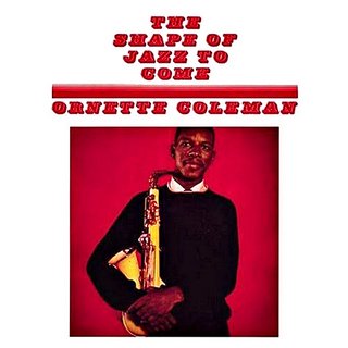
When this album came out the jazz world reverberated---almost as much as the red on the album cover does. It was a line in the sand; no turning back with your rejection or support. Trumpeter Roy Eldridge famously said, "I'd listened to him all kinds of ways. I listened to him high and I listened to him cold sober. I even played with him. I think he's jiving, baby." And on top of the artistic drama, this album came out not as some standard fare black-and- white photo with utilitarian titles; it came out looking like this. Start with the smiling, front-and-center-facing Ornette’s all-black outfit holding the stark shape of his plastic alto sax. In addition to the stark whitish object vibrantly punching through visually, the whole idea of adding to the insult of tradition by letting the world know he played a plastic sax was marketing magic. Reminds me of when the B-52s put that ragged Mosrite guitar on the cover of their first album in the late 1970s. The relationship between the red, black and white is a direct message of “Look out! You put this record on and you’ll hear these very colors in this group!” By namesake coincidence you do hear the colors—literally—the red cherry-rich background is pocket trumpet player Don Cherry, the black is Billy Higgins’ rich, deep, smoky rhythms and the white is the ghostly, more than likely junked-out Charlie Haden, a rail-thin white bassist from Missouri playing wildly punctuated lines. This 1959 look links us to the Warhol to come. The photographer, William Claxton , was known for shooting in Los Angeles jazz clubs with a 4x5 Speed Graphic. He saw shooting album covers as an opportunity to tap further into his love of jazz. On Claxton’s webpage, he reflects on his work from those days. “Photographing a jazz star in, say, 1955 for a record with a 12x12 LP format was a relatively simple and delightful experience. The cover concept would be discussed along with the artist’s wardrobe to be worn, the artist and I would meet at a suitable location and shoot the cover.” When I worked in a used record store way back when, I’d occasionally see the older version of this album come in. The originals had heavy cardboard outer sleeves that had a layer of almost lacquered-on clear plastic. You’d hold it in your hands, the image would set-off against the strong white space and the font would hum in an almost electric way. And the music inside---oh my. Some of my favorite listening moments have happened thanks to what’s inside this album. I am amazed that this music is almost 50 years old and remains completely contemporary. The playing demonstrates the hour upon hour of "woodshedding" it took to get to this level of interplay. You can trace the compositional name somewhat to blues forms that be-bop used, but with incredible twists within the genius of the melodies, in tandem with harmonic somersaults and wide-berth excursions taken in the mesmerizing solos. To me there is an amazing depth of understanding about how to advance tradition and fearless expansion upon the unspoken rules of jazz that were in place in the late 1950’s. Do yourself a favor—get this. Play it and stare at it. Even if means squinting at a small CD cover. Posted by: BOB BURNETTYou can read more of Bob's music review at our C60CD music site.
 John Friar, Neskowin, Oregon I—December 2005 John Friar, Neskowin, Oregon I—December 2005Photographer John Friar has asked for opinions about his new website. I imagine most anyone who reads this blog would enjoy a look at this assured, beautiful work; let John know what you think either in our comments or by contacting him directly. Posted by: MIKE JOHNSTONComment from John Friar: Thank you, to all those who have posted here as well as sent me messages via my website, for your kind words. A few have asked or made suggestions about the website and I'll try and address these now. The website was built from the ground up and originally started as an experiment just to see if I could do it. Once I became more familiar with web technologies, I started to set some technical and design goals for myself. I wanted the site to be simple, fast, intuitive, and complimentary to what I was trying to show (my photographs). I didn't want to burden the viewer with any technical considerations. For me, that meant no plug-ins. This ruled flash out. I started this a few years ago and things have changed so it may be time to review these design decisions. (Thank you shadzee for your reference to autoviewer. I'll check it out). In its current form, my website consists of HTML and cascading name sheets (CSS) for the client-side (your browser). No flash, javascript, or java applets etc. The biggest problem in using CSS was browser compatibility. What worked in Firefox often wouldn't in Internet Explorer. I hope I've got over most of those problems! Please let me know if you discover something that doesn't appear to work in your browser. On the backend (webserver), I've written some java classes and JSP's, and store information in a postgres database. I'm a java developer in my other life so this part was fairly straightforward for me. Finally, the colours! Based on the feedback I'm getting, it seems that the colour that best works with the photos depends upon the viewer. The colour that I chose to default with (blue) is my favourite. But it's not to everyone’s taste. Therefore, the choice is provided. My original intent was based on wishful thinking..."I like this photo, will it go with my green walls?". Also, for this reason, I display the photos as if they're matted and framed (using CSS to achieve the affect). Thanks again to all who have commented.
|
|
 Who could she be, he wondered?

 2 ... 2 ...